SEIKO CLUB SG LOGO

Re: SEIKO CLUB SG LOGO


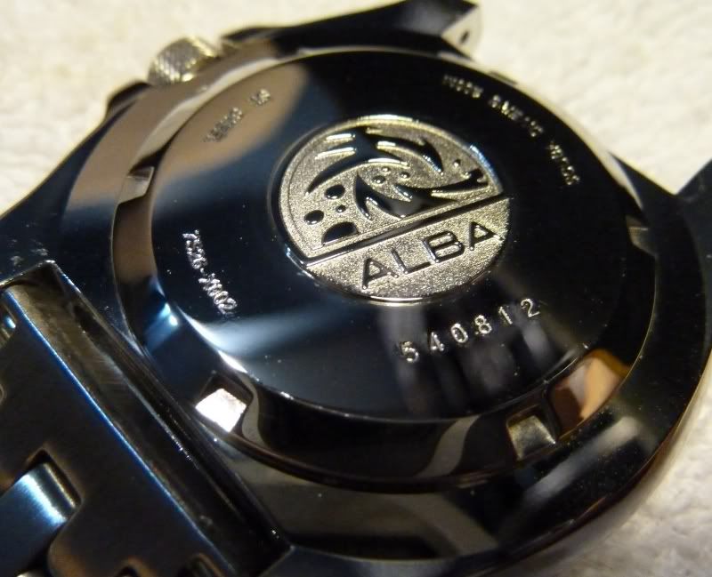
another picture that might be of good use :D
Re: SEIKO CLUB SG LOGO

"stratix"


another picture that might be of good use :D


this will be nice for a tshirt design


:o :lol:
Re: SEIKO CLUB SG LOGO
ALBA Wave Caseback?


Re: SEIKO CLUB SG LOGO
curious qn: is the logo able to fill in all the green area in the top banner?

something like scwf?
Re: SEIKO CLUB SG LOGO

"big-e-294"

curious qn: is the logo able to fill in all the green area in the top banner?

something like scwf?


Yes.. will it be better ?
Re: SEIKO CLUB SG LOGO

"roo7"

[quote="big-e-294"]curious qn: is the logo able to fill in all the green area in the top banner?

something like scwf?


Yes.. will it be better ?[/quote]

dunno.. maybe?

how is the resolution of the pic when it is bigger? can try? 8-)
Re: SEIKO CLUB SG LOGO
hmm....one suggestion for the banner.... we r still missing the title right? some how feel that something is missing.... dun have a focus point....perhaps a SC logo or something?


my 2 cents
Re: SEIKO CLUB SG LOGO

"sinner1974"

hmm....one suggestion for the banner.... we r still missing the title right? some how feel that something is missing.... dun have a focus point....perhaps a SC logo or something?


my 2 cents


Yah, I'm still working on the top banner... :oops:
Re: SEIKO CLUB SG LOGO
hi,


pardon me for my intrusive feedback. personally, as the forum name is seiko club. then it should be only a logo, that says it all. not with citizen and orient. if included other brands on the logo, then it is like mis-matched logo and name *IMHO*.


also, im not sure if there is any infringement trademark/patent/etc with the logo.


though there are many forums worldwide using trademark/patent design/logo/etc. i feel that what other do, let them be. till now there is no one screaming infringement, it does not mean in future they wont.


as this forum is just formed, any changes still will not affect this forum identity. however, when this forum becomes established, changing a logo or something will not reflect good on the forum.


my two cents worth. any opinion is purely my own and there is no malice. if i have offended anyone, i apologize.
Re: SEIKO CLUB SG LOGO
Don't worry, any feedback is good feedback, way better than no feedback.. :)


We don't have any legal advise, hopefully using our photos of the watches is not an infringement, in fact we are providing them free publicity in a way.
Re: SEIKO CLUB SG LOGO
currently the banner using pictures of case back right?


using it to show pictures for no commercial reasons is alright. however the moment you use it for 'branding' or commercial purpose, this is when the owner of the copyright and patent can use legal means.


i will pm you separately on this.


"roo7"


We don't have any legal advise, hopefully using our photos of the watches is not an infringement, in fact we are providing them free publicity in a way.
Re: SEIKO CLUB SG LOGO
Came up with a new logo.. comments & critics are welcome :ugeek:
Re: SEIKO CLUB SG LOGO

"roo7"

Came up with a new logo.. comments & critics are welcome :ugeek:


I like the new logo/banner!

The '+65' is a clever idea. NICE!


But it's not showing up on every page.
Re: SEIKO CLUB SG LOGO
The page probably needs to be refreshed... older logo could be cached by your browser.
Re: SEIKO CLUB SG LOGO
I just realised if you have a bigger screen resolution than 1024, meaning any 17" monitor and above, the logo wraps around... lol.


More tweaking again....
Re: SEIKO CLUB SG LOGO
im not very well versed in seiko watches.


however, compared to the previous logo, i think the previous one is better.


a logo is ideal especially it is a symbolic for a seiko.


if there is a need to use a dial, then it should be one that is iconic or grail.


i find that the logo is 'complicated' the word seiko is seen twice. i dont like the +65.


human's eyes usually scan from top to bottom, left to right. with contrasting colors of red and white, it captures the attention of users.


so you will need to decide what is the focus of the logo that needs to capture user's attention. is it the seiko club? is it +65? or both? what is the purpose the seiko dial then?


a logo should be something simple, iconic that when people see it, they recognize it. just like for linux, the mascot is tux/penguin. for apple is the apple logo, etc.


i apologize if the comments come across as negative. just trying to help.


TS. if it is ok, can i contact you via phone or something? if yes, drop me a pm your contact number.
SEIKO CLUB SG LOGO
No problem.


I wanted a nice banner at the back, so I kept thinking about designing a banner instead of a logo.


From the various inputs, I think the banner as a background should be ok and it can be rotated monthly.


But it's a little distracting with the words over it. Need to adjust the opacity further and tweak the wordings.


Thanks for the offer to help, will PM you if I need any help and advise :)
Re: SEIKO CLUB SG LOGO
the banner looks nice!